9.6 KiB
| order |
|---|
| 2 |
Client Components
To allow more non-developers to participate, NocoBase provides a companion client - a visual interface without code. The client interface is very flexible and consists of different components, which are divided into three categories.
- Routing components created by createRouteSwitch, such as Layout, Page
- Field components created by createCollectionField, used to extend fields
- JSON Schema components created by createSchemaComponent, which can be anything, such as tables, forms, calendars, kanban, etc.
For more on components, see the section on components
Component tree structure
The interface is a component tree composed of components with the following structure.
      // Block, table


            // Fields in table columns
Note: The above example is only for expressing the structure of the component tree and the relationship between components, the actual code does not.
Next, let's introduce the concept of each component in detail.
Layout and pages
Pages are web pages that can be accessed by address. Different pages may have the same header, footer and navigation between them, and usually we put these common contents in the layout component. For example, the initialized NocoBase provides two layout components, as shown in
Figure
- AuthLayout: accessible without login, usually used to embed login, registration, forgot password, etc. pages.
- AdminLayout: requires login and manages all pages of the backend.
Layout and page components are registered through createRouteSwitch, more extensions are available here.
Page content layout
For developers, the writing of page content is free, but to facilitate the layout of page content, two types of layout are provided.
Simple top-down structure
Example
// coming soon
Drag and drop grid
Grid component defines the outer frame of the block based on rows (Grid.Row) and columns (Grid.Col). Examples are as follows:
// coming soon
AddNew
AddNew is the most important button for visual configuration of the page, more about AddNew here
Block
Blocks are generally placed in pages and can be anything, including text, attachments, tables, forms, calendars, kanban boards, etc. A complete block consists of three parts.
- Content, the body of the block
- ActionBar, where you can place various action buttons to manipulate the block data (optional)
- DesignableBar, buttons for operating the block configuration (optional)
Take the table block as an example, the component structure is as follows:
Example
// coming soon
There are several types of blocks.
- Data types, used to display data from data tables, such as tables, calendars, kanban, forms, details, etc.
- Multimedia, for enriching page content, such as text paragraphs, attachments, etc. For now there is only a simple Markdown.
- Charts, for displaying data statistics.
- Templates, which can directly template certain finished products and apply them directly to the page.
Blocks can be extended at will, see the createSchemaComponent chapter for how to do so.
ActionBar
An action bar is a collection of actions, typically used inside a block. The user issues an action command, the program makes a change, and responds with the result in the block's content area.
Example.
Form, the content area is a table, and the action area will place some action buttons, such as filter, add, delete, export, etc
// coming soon
details, the content area is the details of the data, the operation area will be placed on the edit, export and other buttons
// coming soon
The buttons of the action bar may be different for different blocks. The action bar buttons are also customizable, check the action chapter for details.
Action
An action is an encapsulated piece of instruction that generally requires user participation.
For example.
- Delete data, which requires the user to select the data to be deleted, and then trigger the delete command
- Filtering data requires the user to fill in the filter items and then triggers the filter command
- Add data, the user needs to fill in the data and then submit it, triggering the add operation instruction
- View details, the user clicks the operation button, the pop-up window to view the details or the current window to open the details page to view
The simplest operation, you only need to bind a paragraph of instructions, simply specify a function, no need to pass parameters. The component structure is as follows.
Most of the action instructions require user-supplied parameters, such as the add data action, which requires the user to fill in the data, which usually requires a pop-up form, and the user fills in the data and clicks submit to trigger the action instruction. The component structure is as follows.
{/* This is a popup form with a built-in submit button that triggers an action command when clicked, the specific code is omitted */}
A complete action is roughly divided into two steps.
- Bind a directive to the Action
- If the directive requires user-supplied parameters, it needs to provide an interaction interface, which is currently built in as follows
- Action.Drawer: drawer
- Modal: dialog box
- Popover: bubble
Action is a very important concept in NocoBase, more details click here to see
DesignableBar
All Schema Components can be bound to their own configuration toolbar (DesignableBar) for modifying the Schema of the current component.
What is a Schema Component?
A component written in JSON-like Schema format via the Schema protocol, e.g.
{
  type: 'void',
  'x-Component': 'Hello',
  'x-designable-bar': 'Hello.DesignableBar',
  'x-dect': 'CardItem',
}
To give a few examples, e.g.
JSON Schema for form fields
const schema = {
  type: 'string',
  'x-component': 'Input',
  'x-decorator': 'FormItem',
  'x-designable-bar': 'Form.Field.DesignableBar',
};
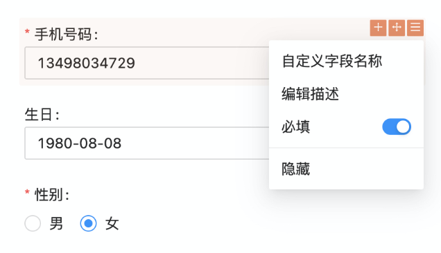
The effect of the form item's configuration toolbar Form.Field.DesignableBar

JSON Schema for the form
const schema = {
  type: 'array',
  'x-component': 'Table',
  'x-decorator': 'CardItem',
  'x-designable-bar': 'Table.DesignableBar',
};
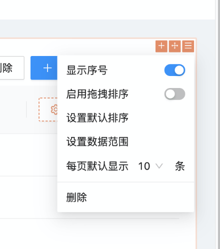
The effect of the table configuration toolbar Table.DesignableBar

JSON Schema for the menu item.
const schema = {
  type: 'array',
  'x-component': 'Menu.Item',
  'x-designable-bar': 'Menu.Item.DesignableBar',
};
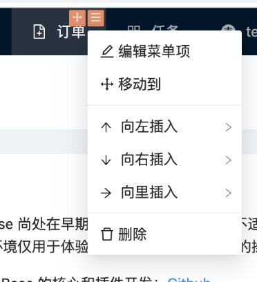
Effect of menu item configuration toolbar Menu.Item.DesignableBar

For more details on the configuration toolbar click here
CollectionField
The configuration parameters of field components can be very many, and the same field component can be used in different data blocks. In order to reduce code duplication, NocoBase assigns the configuration of field components to the data table for unified management. One configuration, many uses. The field component is directly referenced in the data block, and then extended if there are other different parameters.
  // 原生态的写法


  // 简化之后的字段引用
The field component has three display states.
- fillable - editable
- unfillable - disabled
- Read mode - read-pretty
As an example for a single line of text (Input).
// example (three display states for Input)

// example to be added
**Why do fields have multiple display states? **
- In a form, the field is normally filled in (editable), but if it is for viewing only, the field is set to disabled or read-pretty.
- In forms, fields are generally read-pretty, but if you need to edit them quickly within the form, you can dynamically activate a field as editable.
The field component can be extended in any way, see the createCollectionField section for how to do so.